


Ultraman logos are amazing and I can prove it!

Recently, I worked on a project where I decided to use Ultraman logos as a reference. Honestly, I'd never seen the TV series, but the cool look of this Tokusatsu caught my eye. As I dug deeper, I found a ton of amazing Ultraman logo variations!
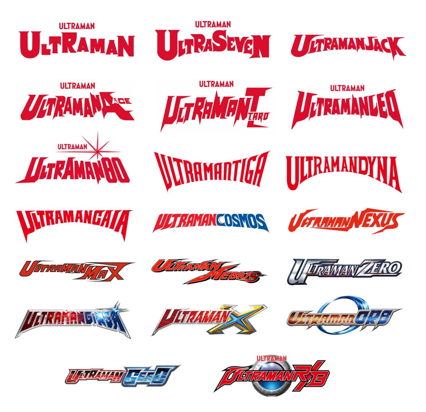
As I kept researching, I started comparing the Japanese and English logos, which made me curious about how they adjust typography for different languages. I'll definitely write about it once I know more.

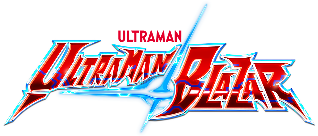
I also want to highlight the awesome typography from the TV series called Ultraman Blazar, released in 2023 for the company's 60th anniversary (Tsuburaya Productions).
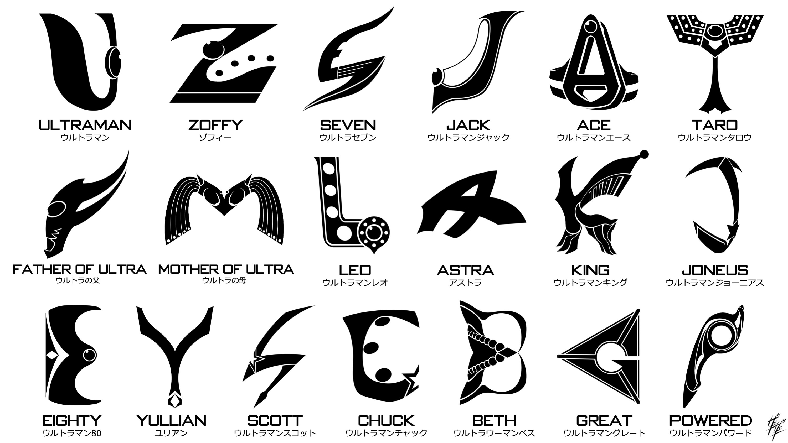
To wrap up, I'd like to share these brilliant fan-made logos by @actct_zagi, which I'll definitely use as a reference
There's still lots more to explore about Ultraman's graphic design, but let's save it for a possible Part 2. Thanks for reading! I'm still getting the hang of this, so feel free to drop a comment if you have anything to add.
definitely check the shows out, they even have a Twilight Zone series "Ultra Q" that focuses on mysterious creatures that is worth watching
When you make typography do you ever start out with an existing font and modify it until unrecognisable, or do you always draw something from scratch?